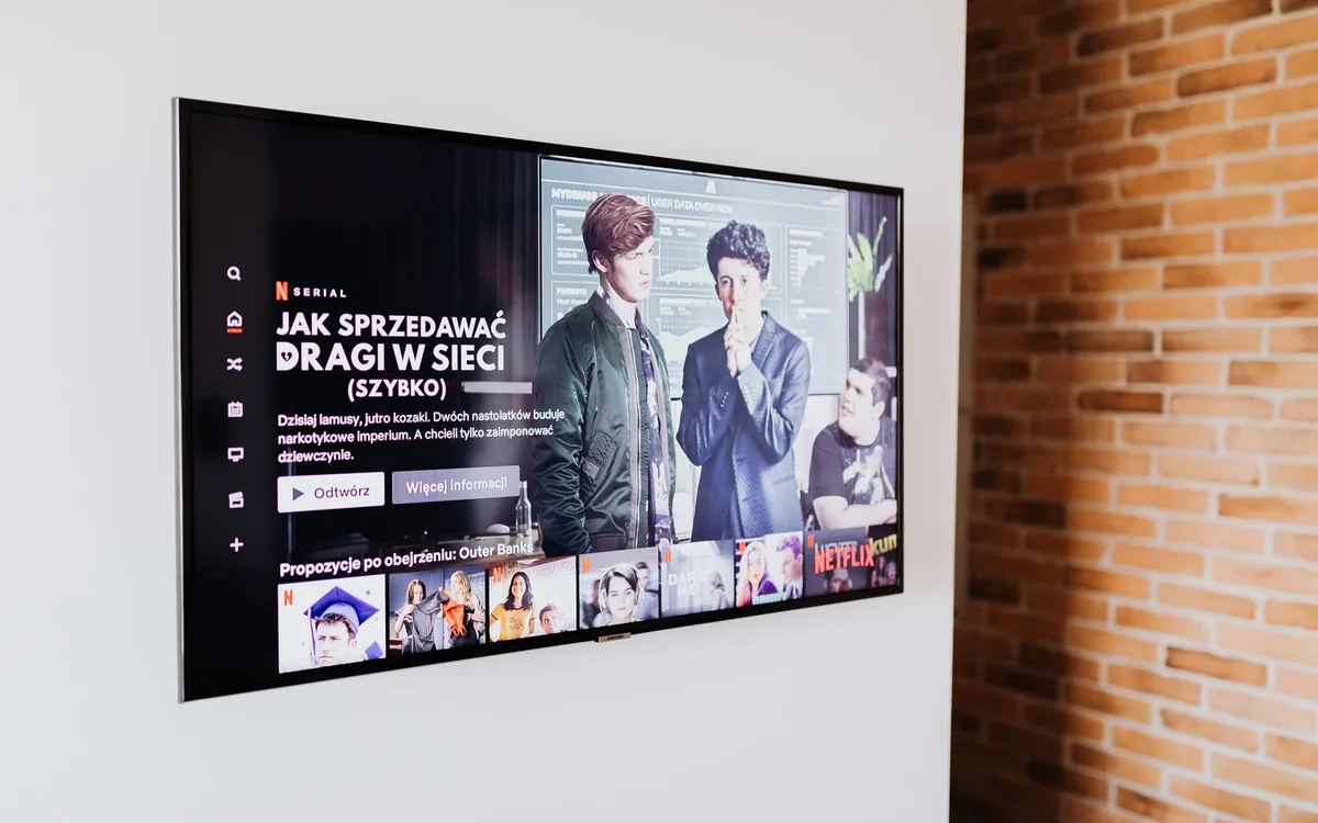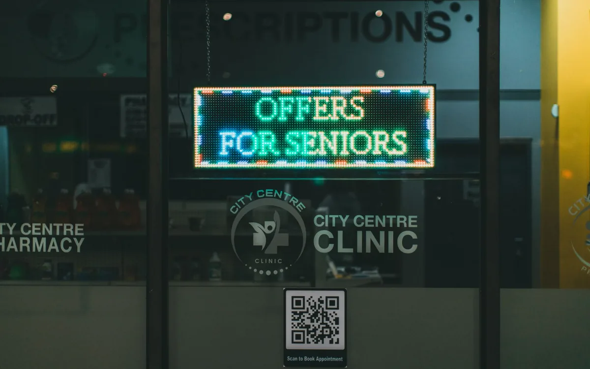
Almost every shop has a screen switched on. Very few have a screen selling. The difference is not the hardware — it is a set of small decisions almost nobody revisits. This checklist is the ruler.
Read it with your screen in front of you. Only tick what is already true today, not what you intend to do.
Placement and visibility (1 to 4)
- 1. The screen is where customers stop (queue, waiting area, counter) — not where there happened to be a socket
- 2. It sits at eye level for someone seated or standing — whichever applies to your space
- 3. No window, spotlight or shop front reflects on it during peak hours
- 4. The main text is readable from three metres away
Content (5 to 9)
- 5. Each piece carries one message — not three offers squeezed into the same artwork
- 6. There is a price, a condition or a clear call to action (not just a nice photo)
- 7. The content is yours — not a broadcast channel showing a competitor’s advert
- 8. Artwork is landscape (16:9), with no black bars and nothing cropped
- 9. At least one piece features your highest-margin product or service, not only the bestseller
Putting the artwork made for Instagram on the screen. A post is square and read from 30 centimetres; a screen is landscape and read from three metres. The same artwork does not work in both.
Rhythm (10 to 12)
- 10. Each piece stays on for 8 to 15 seconds — the length of a real glance
- 11. The whole loop runs no longer than 2 to 3 minutes (otherwise people waiting see everything twice)
- 12. Content changes with the time of day or the day of the week (lunch ≠ evening, Tuesday ≠ Saturday)
Operation and results (13 to 15)
- 13. One named person is responsible for updating it — and can do it from a phone
- 14. No expired offer is on screen (the end date is set at the moment of publishing)
- 15. You can name one thing that changed since the screen went live (combo orders, bookings, questions at the till)
How to read your score
| Ticked | Diagnosis | Next step |
|---|---|---|
| 13 to 15 | Your screen is a sales channel | Start testing offers and timing; the gain is now in content |
| 9 to 12 | On the right track, but leaking results | Fix the placement and rhythm items first |
| 5 to 8 | The screen is decorating | Rewrite the pieces: one message and one price each |
| 0 to 4 | The screen is switched on, and that is all | Start at item 1: where does the customer actually stop? |
The three items that move the needle most
- Placement (items 1 and 2). A screen in the wrong place is not rescued by good content.
- One message per piece (item 5). Cluttered artwork is not read in ten seconds — and ten seconds is all you get.
- An owner for updates (item 13). With nobody responsible, every screen becomes a board of expired offers within 60 days.
Want to go deeper? Start with what indoor media is, then head to your own sector — restaurants, clinics, salons, barbershops, clothing stores or franchises.
Scored under 10? You can fix that today.
Publish your first piece from your phone, with large type and one message. 30 days free, no card.
Try it freeFrequently asked questions
How many pieces should be in the loop?+
Between 6 and 12 for most businesses. Fewer feels repetitive to anyone waiting; more and your main message takes too long to come back around.
Video or still image?+
Both. Short video catches the eye; a still image with a price is what actually gets read. A loop of only video tires people, and a loop of only stills does not attract a glance.
Do I need a designer for the artwork?+
Not to start. A good product photo, a clean background, large type and a legible price already put you ahead of most. A designer improves the result; it is not a prerequisite.
How do I measure without an analytics system?+
The simplest way there is: note how many orders of the featured item went out last week and this week. Change one variable at a time and the number tells the story.